
How To Print CD’s
How to Print on a CD: A 2026 Guide for Artists & DJs
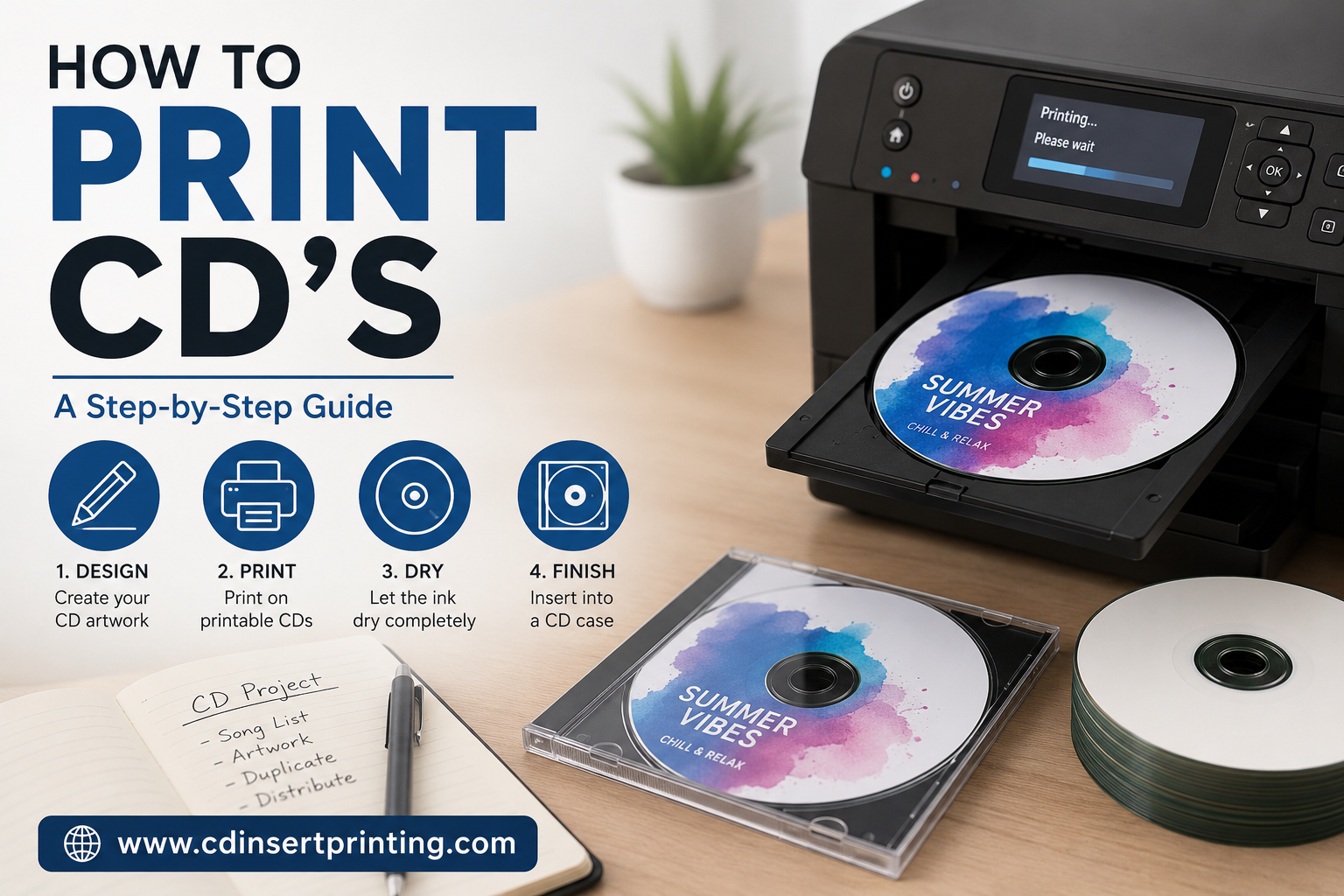
You finished the master. The track list is locked. Maybe the sermon series is edited and exported. Maybe the mixtape finally sounds the way it did in your head. Then you look at the stack of blank discs on your desk and hit the part nobody talks about enough.
A plain silver CD makes your project feel unfinished.
That’s usually the moment people search for how to print on a CD. What they need isn’t just a craft tutorial. They need a decision. Should you print these yourself at home, or should you hand the job to a duplicator and keep your weekend?
For indie artists, DJs, and churches, CDs still have a narrow but real job. They work when you need a physical handoff, a merch-table item, a takeaway after service, or a short-run release that feels more tangible than a download link. Industry-facing guidance aimed at CD on-body printing methods and 2026 use cases also makes the quality gap clear. Professional services separate offset, screen, and digital printing, and those processes often need a white primer because the inks are transparent enough that the disc surface affects the result.
That’s the part a lot of DIY guides skip. Printing a disc isn’t just putting art on a circle. It’s choosing a process that fits your run size, your budget, and how polished the final disc needs to look when someone holds it in their hand.

Your Music Is Ready So Now What
The common first mistake is treating disc printing like an afterthought. It isn’t. If the audio sounds professional and the disc looks rushed, people notice the mismatch right away.
An indie rapper doing hand-to-hand promo usually cares about speed and low upfront cost. A church distributing a sermon series usually cares about clarity, consistency, and not having volunteers troubleshoot printer trays on a Saturday. A band selling CDs at shows usually needs something that looks intentional enough to sit beside shirts and posters without feeling homemade.
The real fork in the road
You’ve got two broad paths:
- DIY disc printing: You buy printable discs, use a compatible printer, build the label, and print in-house.
- Professional duplication and printing: You send art and audio files out, and a disc service handles print, duplication, and often packaging too.
Neither path is automatically right.
DIY works when your run is small, your timeline is flexible, and you can tolerate trial and error. It also works best when your expectations are realistic. You’re aiming for clean and presentable, not necessarily retail-shelf polish.
Professional printing makes more sense when presentation matters, when you need matching copies, or when you also need sleeves, jewel cases, inserts, or wallets. That’s especially true if you already know you hate printer setup work.
Practical rule: If printing the discs feels like it’s distracting you from release prep, merch setup, or event planning, the labor cost is already showing up. You’re just paying it in time instead of cash.
What artists usually underestimate
It’s commonly thought that the hard part is designing the artwork. Often it’s not. The hard part is getting a disc to print centered, dry cleanly, and look good enough across the whole batch.
The frustration isn’t dramatic. It’s small, annoying failures. A tray loads slightly off. A title prints too close to the hub. Black areas look softer than expected. One disc is fine, the next is a little crooked. If you only need a handful, maybe that’s acceptable. If you need something consistent for a release table or ministry distribution, it starts to wear thin fast.
That’s why the smartest question isn’t just how to print on a CD. It’s whether printing on the disc itself is the right move for your project at all.
Choosing Your CD Printing Method
A lot of short-run CD projects go sideways here. The music is finished, the deadline is close, and the printing method gets picked based on whatever seems fastest that night. That usually leads to one of two outcomes. You spend more time fighting the process than expected, or you get discs that technically work but do not look like something you want to hand to fans, church members, or clients.
For small runs, there are three practical options. They are not equal.
CD Printing Method Comparison
| Method | Cost Per Disc | Final Quality | Best For |
|---|---|---|---|
| Adhesive paper labels | Low upfront cost, but mistakes can waste discs fast | Usually the weakest-looking option, especially if the label is slightly off-center or starts lifting | Personal copies, test discs, or one-off internal use |
| Direct-to-disc inkjet printing | Moderate cost if you already have a compatible printer | Solid for short runs if you use printable discs and accept some setup time | Indie artists, DJs, churches, and small organizations making limited batches |
| Professional printing services | Higher per-order cost, lower labor on your side | Most consistent and polished result | Releases, merch tables, events, resale, and projects where presentation matters |
Adhesive labels are the first method I would rule out
They look cheap for a reason.
Stick-on labels add a second alignment job after the disc is already burned. If that label goes on slightly crooked, the disc looks off immediately. If air gets trapped, it looks worse. If the edge starts to peel later, it looks like a home project in the wrong way.
They also create more handling risk. By the time people use labels, they have already spent time burning or duplicating the disc, so one bad application can ruin a finished copy. For artists selling merch or churches handing out sermon series, that trade-off rarely makes sense.
Direct-to-disc inkjet printing is the DIY option that actually holds up
If a home setup is going to work, this is usually the method.
You print straight onto an inkjet-printable disc surface using a printer with a disc tray. That removes the label problem and gives you a cleaner result. It also keeps the process simple enough for a short run, especially if you need a few dozen copies and your schedule can absorb test prints.
The catch is consistency. Some printers feed disc trays better than others. Some printable discs accept ink cleanly, while others dry slower or show softer blacks than you expected. Full-color artwork can look good, but it often looks better on screen than on the finished disc. Bold layouts, strong contrast, and restrained text usually print better than fine details and subtle fades.
This method makes sense when the batch is small, the budget is tight, and you can tolerate a few setup passes before the output looks right.
Professional printing changes the standard
Professional disc printing is less about convenience and more about repeatability.
Disc Makers’ explanation of silkscreen disc printing shows why professionally printed discs look different. The process uses separate film layers for each color and pushes ink through mesh onto the disc surface. A white flood coat is often used first, which helps colors print more solidly. It also explains why certain artwork choices, especially gradients and soft blends, can behave differently in production than they do in a design mockup.
That matters if you care about matching copies across the run. It matters even more if the disc is part of a package with inserts, wallets, or cases and you want the whole release to feel intentional.
A practical way to choose
Use adhesive labels only if appearance does not matter much.
Use direct-to-disc inkjet printing if you need a short run, already own the right printer, and can live with some trial and error.
Use a pro if the discs are for sale, for an event, or for any release where inconsistent print quality will bother you every time you open the box. That is usually the better call once the project starts feeling like production work instead of a quick home task.
Preparing Your Artwork for a Perfect Print
A disc isn’t a sheet of paper with a hole punched in the middle. If you design it that way, your first print will tell you fast.
Canon’s explanation of CD structure and data placement is useful here because it shows why disc artwork has to respect the object itself. A standard CD is 1.2 mm thick, and the data sits as pits in the inner face of the clear plastic layer. Canon describes those pits as roughly 0.5 μm wide and several micrometers long. The printed surface is separate from that data layer, which means your artwork belongs on a limited printable area that has an inner hub, a mirror band, and an outer edge.

Design for the printable area, not the whole circle
The alignment of the print often derails home jobs. People center a logo beautifully on-screen, then print it and discover that text is riding the hub or getting pushed too close to the outside edge.
Treat the disc template as a hard boundary. Keep important text, logos, and fine details away from both the center opening and the outer edge. On a disc, the “safe area” matters more than people expect because even slight alignment drift becomes obvious on circular artwork.
A few habits help:
- Use the exact template for your printer or label software. Don’t guess the inner and outer print limits.
- Keep small text inward from the edge. Circular layouts exaggerate tiny alignment problems.
- Avoid critical details in the mirrored band area. Even if your software shows a full circle, the physical disc may not print the whole visible top surface the way you expect.
Build art that prints cleanly
Disc art isn’t the place for fragile design choices.
Use strong contrast. Use readable type. If you’re designing for home inkjet output, expect that deep blacks, skin tones, and subtle shadows may not look exactly like your monitor. Fine gradients are especially risky on disc surfaces, and as noted earlier, industrial silkscreen guidance specifically warns that gradients can be unreliable.
Keep the disc face simpler than the cover insert. The disc is a small target, curved visually by the center hole, and usually viewed in motion or under uneven light.
A preflight checklist worth following
Before you export or print, check these basics:
- Template fit: Make sure the file matches the disc layout your software expects.
- Text placement: Artist name, title, and contact details should sit comfortably inside the printable zone.
- Image clarity: Soft source files will still look soft after printing.
- Color expectations: Home printers and professional print workflows won’t render color exactly the same.
- Final proofread: Typos on a disc feel permanent because they are.
If you want a better-looking result, the design job is not just making it attractive. It’s making it printable.
Your Direct-to-Disc Printing Workflow
Your music is mastered, the artwork file is approved, and the release date is close. This is the point where DIY printing either feels efficient or turns into an evening of wasted discs and tray errors.

For a short run, direct-to-disc printing can make sense. A church burning 25 sermon CDs or an indie artist making 50 demo copies can get a decent result at home if the printer is compatible, the media is correct, and expectations stay realistic. If you need every disc to match, or you are printing enough copies that mistakes start getting expensive, this is usually where a pro duplicator starts to look cheaper than DIY.
Set up the job before you print anything
Start with the physical pieces. Use inkjet-printable discs with a coated white or silver printable face, not standard glossy-top blanks. Then confirm that the printer supports disc printing and that you have the correct tray for that model.
That sounds obvious, but a lot of failed jobs come from forcing the wrong combination of printer, tray, and media.
Open the disc print utility or label software that matches your printer. Select the disc-print setting, confirm the template size, and check that the printable area matches the discs on your desk. If your printer supports both CD and DVD trays or multiple inner-diameter settings, slow down here. A small mismatch shows up fast on a disc.
Build a repeatable print routine
Home CD printing works better when the process is boring and consistent. Load one disc at a time. Keep the tray clean. Use the same print setting for the full run once you know it works.
A simple shop-floor routine looks like this:
- Load the tray the same way every time, with the printable side facing up.
- Confirm the printer is in disc-print mode, not paper mode.
- Send one test print only.
- Let that disc dry fully before judging color or handling.
- Print the rest in a small batch, not the whole stack at once.
This is slower than people want. It is also how you avoid ruining ten discs in a row because one setting was off.
Test alignment on paper first
Before you touch printable media, run a draft on plain paper and compare the placement against a disc. As noted earlier, a paper alignment check catches tray-position problems before they become wasted stock.
Use that test to look for practical issues, not perfection on a monitor:
- Title too close to the hub
- Artwork riding high or low
- Logos drifting toward the outer edge
- Circular text that looks centered on-screen but prints slightly rotated
Make small corrections. On discs, tiny moves matter.
Print one keeper before you batch the job
Once the paper test looks right, print a single disc and treat it as your approval copy. Check it under normal room light, not just under the printer lid. Dark fills can print heavier than expected, skin tones can shift, and fine details can soften on absorbent printable surfaces.
This is the point where the DIY versus pro decision becomes real. If one approved disc is enough and the rest only need to be close, keep going. If you need 100 copies that all look consistent, home inkjet printing starts to show its limits fast.
Let the discs dry and handle them like finished media
Freshly printed discs mark easily. Hold them by the edge and center hole, and give them time to dry before stacking, sleeving, or loading them into players.
I usually tell artists to budget more time for drying than they expect, especially with designs that use heavy dark coverage. The print may look done when it exits the tray, but the surface can still scuff if you rush it.
Watch for drift during the run
Even after a clean first print, things can shift. The tray may not seat the same way every time. The software may remember the wrong setting from a previous job. A stack of discs from mixed spindles may not all have the same printable margin.
So check every few copies.
If the job starts drifting off-center, stop the run and reset before printing more. That pause is annoying, but it is still cheaper than reprinting a whole short run.
How to Fix Common CD Printing Problems
DIY disc printing breaks down in a few predictable ways. That helps, because you can usually trace the problem to setup, media, or printer maintenance instead of guessing.
It still costs discs to learn that lesson.
Off-center artwork
A disc can look only slightly off and still feel amateur once it is in a jewel case. For bands selling merch after a show or churches handing out sermon CDs, that small shift stands out fast.
Start with the mechanical causes first:
- Re-seat the tray the same way every time. A small loading difference is enough to move the print.
- Confirm the disc template and printer setting match the media. Inner and outer print areas vary more than many people expect.
- Adjust the artwork in very small increments. Big corrections usually overshoot the mark.
If the first few discs keep drifting in the same direction, stop and correct it before you burn through the stack. On a short run, that pause saves money. On a larger run, it is often the moment to ask whether home printing is still worth your time.
Smudged or tacky ink
This usually comes down to the disc surface or the amount of ink going down. Printable CDs are not all coated the same way, and cheaper media often takes longer to dry or marks more easily.
A few fixes work better than trying to baby the finished print:
- Use inkjet-printable discs only. Standard shiny discs are the wrong surface.
- Cut back heavy solid coverage. Large black or dark blue backgrounds are where home setups struggle most.
- Choose a lower ink setting if your printer allows it. Slightly lighter coverage often looks cleaner on disc stock.
- Give the print more drying time than seems necessary. Especially on jobs with dark artwork.
If you need discs bagged, sleeved, or handed out the same day, smearing becomes a real production problem. That is one of the clearest cases where a pro duplicator starts making more sense than DIY.
Dull or unexpected color
Printed discs almost always look less vivid than the file on a bright monitor. That is normal. The mistake is trying to force the printer to match the screen exactly.
Better results usually come from design changes, not endless test prints. Increase contrast. Make text heavier. Avoid subtle gradients and low-contrast color combinations that disappear on matte printable surfaces.
What reads clearly from two feet away usually prints better than artwork built for a screen mockup.
Lines, streaks, or banding
Banding is usually a printer issue. If the printer has been sitting for weeks between jobs, dried ink in the nozzles is a common cause.
Run the printer’s nozzle check and cleaning cycle first. Then print a simple test image on plain paper or a sacrificial disc before you resume the job. If lines keep showing up after cleaning, you are no longer fixing a one-off problem. You are fighting the limits of the hardware.
That matters because troubleshooting has a cost. For ten discs, you can tolerate some trial and error. For fifty or a hundred, time spent cleaning heads, re-aligning trays, and reprinting rejects can wipe out the savings that made DIY appealing in the first place.
When to Skip DIY and Use a Pro Duplicator
DIY is worth it when you need a small batch, you already own the right printer, and you don’t mind testing, adjusting, and reprinting. For a home studio release or a quick sermon handout, that can be enough.
But some jobs don’t benefit from doing everything yourself.
Signs the job has outgrown the home setup
It’s time to hand it off when these start to matter more than saving a little money up front:
- You need consistency across the batch. Matching discs matter if you’re selling them or distributing them publicly.
- You want packaging too. Inserts, sleeves, wallets, and cases turn this into more than just a print job.
- You’re short on time. Troubleshooting trays and alignment is slow work when a release date is close.
- The disc is representing your brand. If first impression matters, the print quality needs to feel intentional.
There’s also a simple reality check. If the disc itself isn’t necessary, don’t force it. Sometimes a sleeve with a printed insert or even a download card makes more sense than printing directly on the disc.
If you do need physical CDs and you want them to look clean without fighting the hardware, professional duplication is not giving up. It’s choosing the right production method for the project.
If you’d rather spend your time promoting the release than aligning disc trays, www.cdinsertprinting.com is one practical option for short-run CD duplication and printing, including printed discs and packaging aimed at artists, DJs, churches, and indie labels.
About the Author: CDinser
